Responsive Images are coming
State Of the Browser - London, April 2014
Who????


- Srcset & Picture implementation
What is Responsive images?
Efficiently load properly dimensioned images that fit the page's design
Started out as
Turned out to be

And...
Large images?

People demanded a solution

Turned to the mailing lists

Proposals!

Moar proposals!

And the RICG was born

Picture vs. srcset
2 years later
http://www.jokeroo.com/pictures/funny/893657.html
The road there wasn't easy

http://memoirvita28.blogspot.fr/2012/11/the-road-not-taken.html
Src-N
Then some more

And MOAR
Back to picture

And now

Picture 2.0™
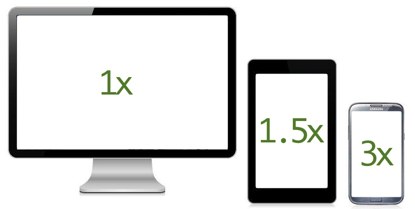
The srcset 'x' part
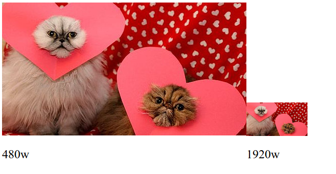
Use case - "Retina images"
Load hi-res images
on hi-res devices
The syntax
<picture>
     <source media="(min-width: 45em)"
             srcset="large.jpg 1x, large-2x.jpg 2x">
     <source media="(min-width: 18em)"
             srcset="medium.jpg 1x, medium-2x.jpg 2x">
     <img src="small.jpg" srcset="small-2x.jpg 2x"
          alt="The president.">
</picture>
Or even
<img src="small-1x.jpg" srcset="small-2x.jpg 2x"
     alt="The president.">
The <picture> part
Use case - Art direction

Use case #2 - MIME type fallback
The syntax
<picture>
     <source media="(min-width: 45em)" srcset="large.jpg">
     <source media="(min-width: 18em)" srcset="medium.jpg">
     <img src="small.jpg" alt="The president.">
</picture>
The <img> is not optional
<picture>
     <source media="(min-width: 45em)" srcset="large.jpg">
     <source media="(min-width: 18em)" srcset="medium.jpg">
     <img src="small.jpg" alt="The president.">
</picture>
The sizes + srcset 'w' descriptor part

http://ericportis.com/posts/2014/srcset-sizes/
use case - variable width images

The syntax
<picture>
    <source media="(max-width: 80em)"
            sizes="(max-width: 30em) 100vw,
             (max-width: 50em) 50vw,
             calc(33vw - 100px)"
            srcset="pic100.jpg 100w, pic200.jpg 200w,
                    pic400.jpg 400w, pic800.jpg 800w, pic1600.jpg 1600w,
                    pic3200.jpg 3200w">
    <img src="otherpic.jpg" alt="The president giving an award.">
</picture>
Or even
<img src="otherpic.jpg" alt="The president giving an award."
     sizes="(max-width: 30em) 100vw,
         (max-width: 50em) 50vw,
         calc(33vw - 100px)"
     srcset="pic100.jpg 100w, pic200.jpg 200w,
             pic400.jpg 400w, pic800.jpg 800w, pic1600.jpg 1600w,
             pic3200.jpg 3200w">
Browser support

Firefox
Actively implementing!Blink - Chrome & Opera
Actively implementing!IE
Showing interestWebKit
Implemented srcset's 'x' descriptor
Willing to accept patches behind a compile flag
Gotchas
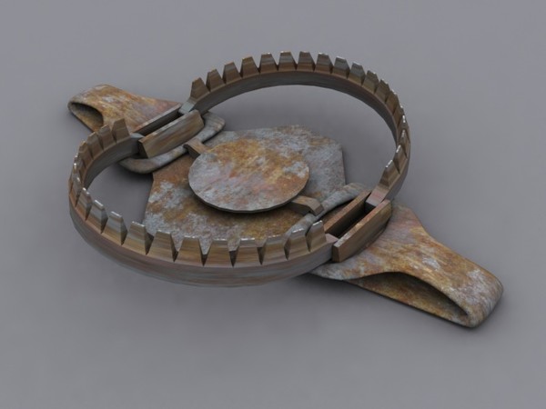
http://jaddid.com/bear-trap/attachment/4650/
'w' descriptror without 'sizes'
<img src="otherpic.jpg" alt="The president giving an award."
     srcset="pic100.jpg 100w, pic200.jpg 200w">
<img src="otherpic.jpg" sizes="100vw"
     alt="The president giving an award."
     srcset="pic100.jpg 100w, pic200.jpg 200w">
Sizes has no impact on 'x' descriptors
<img src="pic1x.jpg" sizes="1vw"
     alt="The president giving an award."
     srcset="pic2x.jpg 2x, pic4.jpg 4x">
Intrinsic sizing
Moar intrinsic sizing
@viewport should be inlined!
<style>
    @viewport {
        width: auto;
    }
</style>
'x' and 'w' resources can be mixed
<img src="otherpic.jpg" alt="The president giving an award."
     srcset="pic-2x.jpg 2x, pic200.jpg 200w,
             pic400.jpg 400w, pic800.jpg 800w, pic1600.jpg 1600w,
             pic3200.jpg 3200w">
You really shouldn't
'x' and 'w' descriptors cannot
A big no no
<img srcset="pic200.jpg 100w 2x, pic200.jpg 200w, pic400.jpg 400w,
             pic800.jpg 800w, pic1600.jpg 1600w, pic3200.jpg 3200w">

src cannot be selected when 'w' is present
<img src="otherpic.jpg" alt="The president giving an award."
     srcset="pic100.jpg 100w, pic200.jpg 200w">
src can be selected when only 'x' is present
<img src="small-1x.jpg" srcset="small-2x.jpg 2x"
     alt="The president.">
Old 'w' syntax
Very similar, but very differentStyling
"Picture is a magical span, nothing more"
- Tab Atkins
Polyfilling
Picturefill
The official spec-compliant RICG polyfill
Community effort led by the Filament Group
Polyfilling gotchas
Double download
Old 'w' syntax polyfill
Future compat
Feature detection FTW!
HTMLImageElement.sizesHTMLPictureElementThanks!
@yoavweiss on Twitter & GitHub