Responsive Images
W3C TAG F2F - London, January 2014
Responsive images problem
Load properly dimensioned images that fit the page's design in an efficient manner
RWD is awesome!

Images?
Not a problem!
EAZZZZZZY!!!

Well...
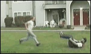
This led to BLOAT!!!
72% Serve same resources
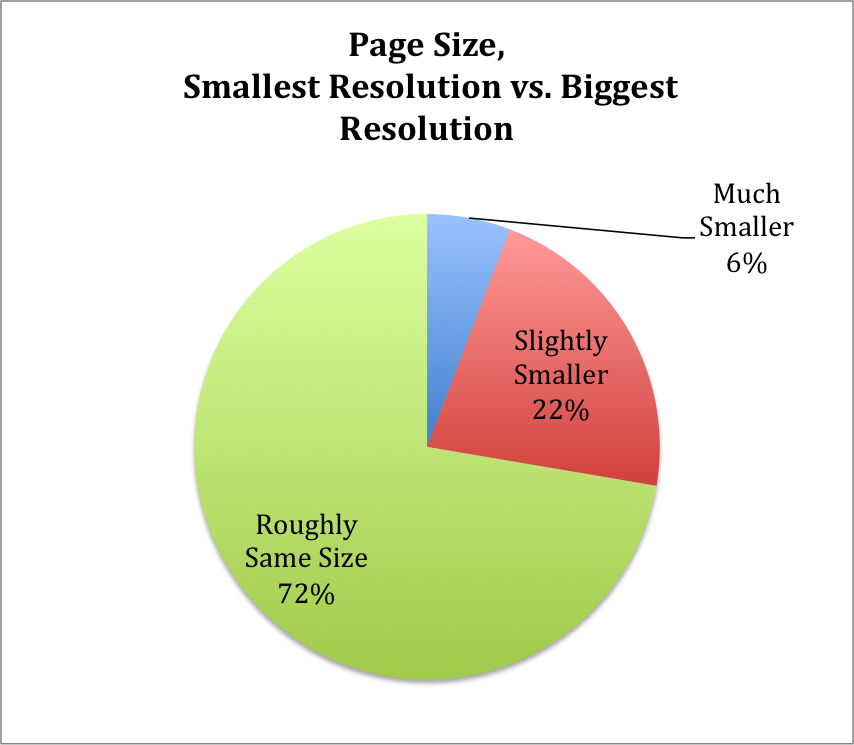
Which resources?
Images - over 61%
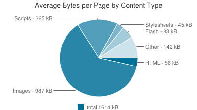
How much can be saved?
Up to™ 72% image data savings
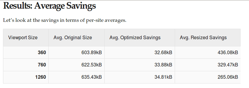
Retina only increases these gaps
The difference between low end, small devices and high-end wide devices increases
Responsive Images Problem
3 major use cases
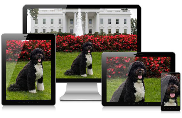
DPR switching
Sending retina images only to retina screens
Viewport switching
Sending variable width images adapted to their display dimensions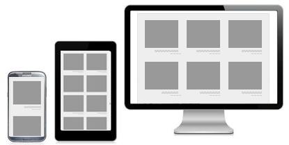
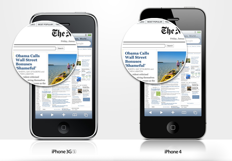
Art Direction
Sending images that match layout
Provide further context when necessary
Solution constraints
Must play well with preloaderProposed Standard Solutions (left standing)
<picture>(2.0) element- Client-Hints headers
picture 2.0
Merges together the benefits of 3 previous proposals- srcset - DPR switching
- picture - art direction
- srcN - viewport switching
Mechanisms
<source>- art directionsrcset- DPR or dimensionssizes- layout hints
Examples
DPR switching
  <picture>
    <source srcset="pic1x.jpg 1x, pic2x.jpg 2x, pic4x.jpg 4x">
    <img alt="A rad wolf." src="pic1x.jpg">
  </picture>
  <img srcset="pic1x.jpg 1x, pic2x.jpg 2x, pic4x.jpg 4x"
       alt="A rad wolf." src="pic1x.jpg">
Art direction
<picture>
<source media="(min-width: 45em)" srcset="large.jpg">
<source media="(min-width: 18em)" srcset="med.jpg">
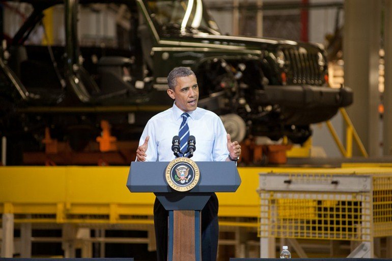
<img src="small.jpg" alt="The president giving an award.">
</picture>
Art direction + DPR
  <picture>
     <source media="(min-width: 45em)" srcset="large-1.jpg, large-2.jpg 2x">
     <source media="(min-width: 18em)" srcset="med-1.jpg, med-2.jpg 2x">
     <img src="small-1.jpg" srcset="small-1.jpg, small-2.jpg 2x"
          alt="The president giving an award.">
  </picture>
Viewport switching
  <picture>
    <source sizes="100%"
            srcset="pic400.jpg 400w, pic800.jpg 800w, pic1600.jpg 1600w">
    <img src="pic400.jpg" alt="The president giving an award.">
  </picture>
  <img sizes="100%"
       srcset="pic400.jpg 400w, pic800.jpg 800w, pic1600.jpg 1600w"
       src="pic400.jpg" alt="The president giving an award.">
Viewport switching #2
  <picture>
    <source sizes="(max-width: 30em) 100%, (max-width: 50em) 50%,
                   calc(33% - 100px)"
            srcset="pic100.jpg 100w, pic200.jpg 200w, pic400.jpg 400w,
                    pic800.jpg 800w, pic1600.jpg 1600w, pic3200.jpg 3200w">
    <img src="pic400.jpg" alt="The president giving an award.">
  </picture>
  <img sizes="(max-width: 30em) 100%, (max-width: 50em) 50%,
              calc(33% - 100px)"
       srcset="pic100.jpg 100w, pic200.jpg 200w, pic400.jpg 400w,
               pic800.jpg 800w, pic1600.jpg 1600w, pic3200.jpg 3200w"
       src="pic400.jpg" alt="The president giving an award.">
Client Hints
- HTTP based content-negotiation solution
- Client sends hints/capabilities
- Server side logic decides on resource
Request headers
CH-DPR
CH-RW
Resource WidthImplicitly relies on sizes
Response headers
DPR
Server confirmation header
Used for intrinsic image sizing
Opt-in only
Not sent on initial HTML request
Responsive Image Container
- File format approach
- A "layer" per resolution
- Both resolution switching and art-direction
Resolution switching
336x635

106x200
211x400
336x635
Art-direction
770x512

200x200
400x288
770x512
Advantages
- Markup left untouched
- A single file per image
- Better for post-download dimensions changes
disadvantages
- Touches many layers. Will take time
- Decoding performance???
- Fetching mechanism network performance???
Implementation status
- Chrome/Blink - CH & srcset DPR behind a flag
- WebKit - srcset DPR
- Gecko - interested in
<picture>
Thanks!
Questions?
RWD - http://www.flickr.com/photos/axbom/6263640150/sizes/o/in/photostream/
Bloat - http://www.flickr.com/photos/lorenjavier/5013332959/sizes/l/in/photostream/
CNN - http://mobile.smashingmagazine.com/2010/11/03/how-to-build-a-mobile-website/
Wap 2 site - http://www.coffeeshopdave.com/Helio_WAPv2.html
Lego - http://lego.wikia.com/wiki/Service_Crew_Member