Responsive Images
Are Coming!
Who????
What is Responsive images?
Efficiently load properly dimensioned images that fit the page's design
<history>
At the beginning
Mobile Web
And then
RWD
- Media Queries
- Fluid grids
- Flexible images
"Flexible images???"
"That's easy"
"Just send the largest possible image"
"And let the browser resize it"
EAZZZZZZY!!!
BLOAT!!!
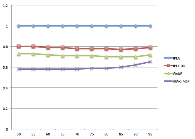
72% Serve same resources
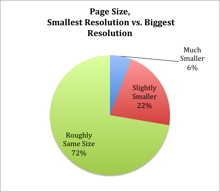
Which resources?
Images - over 63%
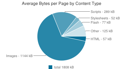
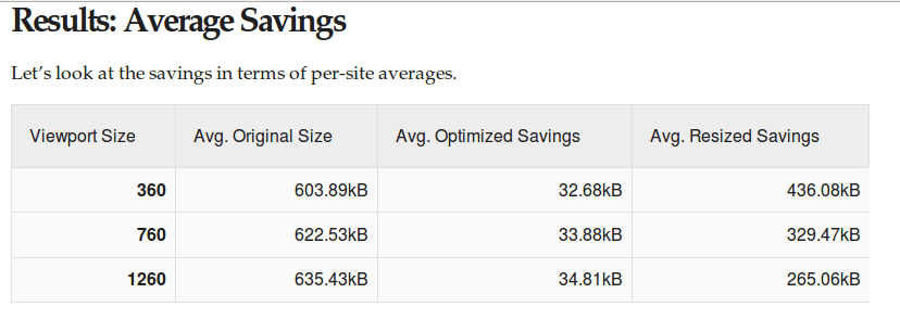
How much can be saved?
Up to™ 72% image data savings
data plan abuse
People demanded a solution
Turned to the mailing lists

Proposals!

Y U NO MEDIA ATTR
Moar proposals!
Y U NO CSS
And MOAR!!!
Y U NO JS
<picture> proposal
srcset proposal
Picture vs. srcset!
Picture *and* srcset
Browsers weren't convinced
9 months later
Src-N
Moar proposals???
Y U NO *
Back to picture
Mozilla were positive
Blink tho
So, crowdfunding to the rescue
Patches got landing
~80 patches later
Blink work is done
WebKit is half way through
Shipped in Chrome 38
A group effort
</history>
<syntax>
The srcset 'x' part
Use case
"Retina images"
Load hi-res images
on hi-res devices


<img src="1x.jpg"
    srcset="2x.jpg 2x, 2.6x.jpg 2.6x"
     alt="A giraffe.">
The <picture> part
Use case
Art direction


<picture>
     <source media="(min-width: 45em)"
               srcset="large.jpg">
     <source media="(min-width: 18em)"
               srcset="medium.jpg">
     <img src="small.jpg" alt="The president.">
</picture>
Use case #2 - MIME type fallback
Mime type fallback syntax
<picture>
     <source type="image/webp"
               srcset="prez.webp">
     <source type="image/vnd.ms-photo"
               srcset="prez.jpx">
     <img src="prez.jpg" alt="The president.">
</picture>
The sizes + srcset 'w' descriptor part
use case
variable width images

<img src="panda.jpg"
     sizes="100vw"
     srcset="panda200.jpg 200w,
             panda400.jpg 400w, panda800.jpg 800w,
             panda1200.jpg 1200w, panda2400.jpg 2400w"
     alt="A panda.">
<img src="panda.jpg"
     srcset="panda200.jpg 200w,
             panda400.jpg 400w, panda800.jpg 800w,
             panda1200.jpg 1200w, panda2400.jpg 2400w"
     alt="A panda.">
<img src="senator.jpg"
     sizes="44vw"
     srcset="senator200.jpg 200w,
             senator400.jpg 400w, senator800.jpg 800w,
             senator1200.jpg 1200w, senator2400.jpg 2400w"
     alt="A senator.">
But wait, there's more
<img src="thumb.jpg"
     sizes="(min-width: 1200px) 235px,
          (min-width: 641px) 24vw,
          (min-width: 470px) 235px,
          50vw"
     srcset="thumb100.jpg 100w,
             thumb200.jpg 200w, thumb235.jpg 235w,
             thumb470.jpg 470w"
     alt="Some animal.">
Separation of concerns?
`sizes` is an optimization
All together now
<picture>
<source media="(min-width: 641px)"
sizes="(max-width: 1600px) 100vw,
1600px"
srcset="sloth_bg_640.jpg 640w,
sloth_bg_960.jpg 960w, ...">
<img src="sloth.jpg"
srcset="sloth_320.jpg 320w,
sloth_480.jpg 480w, ..."
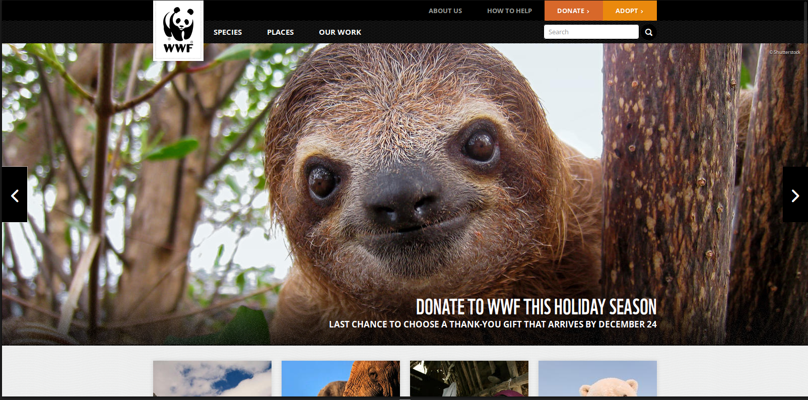
alt="A rad sloth.">
</picture>
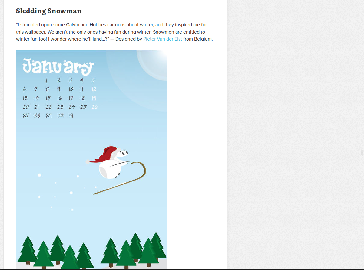


<img src="snowman.jpg"
     sizes="(max-width: 580px) 100vw,
            500px"
     srcset="snowman_250.jpg 250w,
             snowman_500.jpg 500w, ..."
     alt="A rad snowman.">
</syntax>
<support>


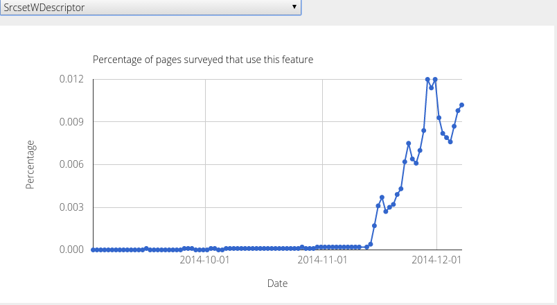
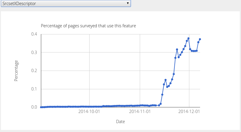
srcset 'w' usage
<picture> usage
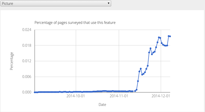
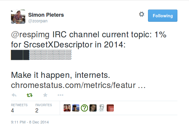
srcset 'x' usage
</support>
<advice>
To picturefill or
<picture> or srcset?
Source order matters
<picture>
     <source media="(min-width: 45em)"
               srcset="large.jpg">
     <source media="(min-width: 18em)"
               srcset="medium.jpg">
     <img src="small.jpg" alt="The president.">
</picture>
!=
<picture>
     <source media="(min-width: 18em)"
               srcset="medium.jpg">
     <source media="(min-width: 45em)"
               srcset="large.jpg">
     <img src="small.jpg" alt="The president.">
</picture>
Source-size order matters
sizes="(max-width: 30em) 100vw,
     (max-width: 50em) 50vw,
     calc(33vw - 100px)"
!=
sizes="(max-width: 50em) 50vw,
     (max-width: 30em) 100vw,
     calc(33vw - 100px)"
'sizes' default value
<img src="otherpic.jpg"
     srcset="pic100.jpg 100w, pic200.jpg 200w">
<img src="otherpic.jpg" sizes="100vw"
     srcset="pic100.jpg 100w, pic200.jpg 200w">
Styling
"Picture is a magical span, nothing more"
- Tab Atkins
Alternative text
Future compat
Feature detection FTW!
HTMLImageElement.sizes&HTMLPictureElement
Which resource was picked?
HTMLImageElement.currentSrc</advice>
The path not (yet) taken
Client Hints
Content negotiation based
To sum it up
Responsive images
are coming HERE!
Start with srcset
The Web is ours!
Thanks!
@yoavweiss on Twitter & GitHub