Responsive Images
BlinkOn - Zurich, May 2014
Who????


- Srcset & Picture implementation
What is Responsive images?
Efficiently load properly dimensioned images that fit the page's design
Started out as
"But that's easy"
"Just send the largest possible image"
"And let the browser resize it"
EAZZZZZZY!!!

Well...
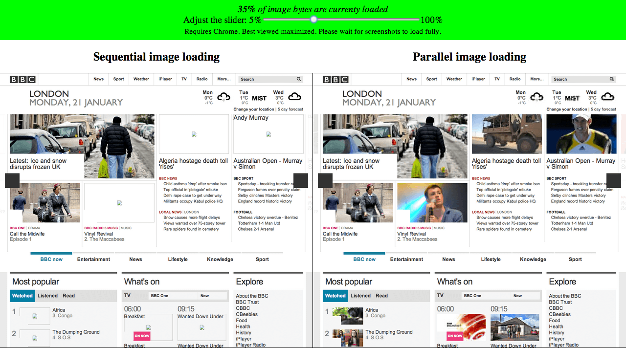
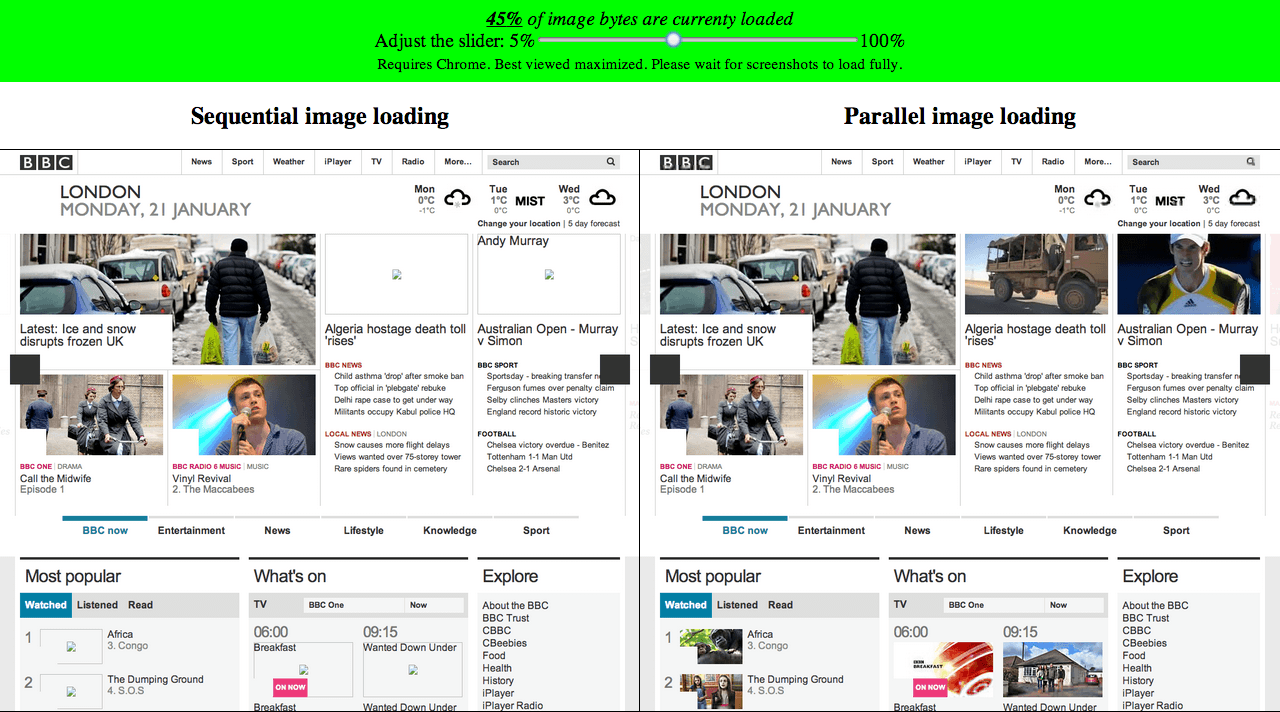
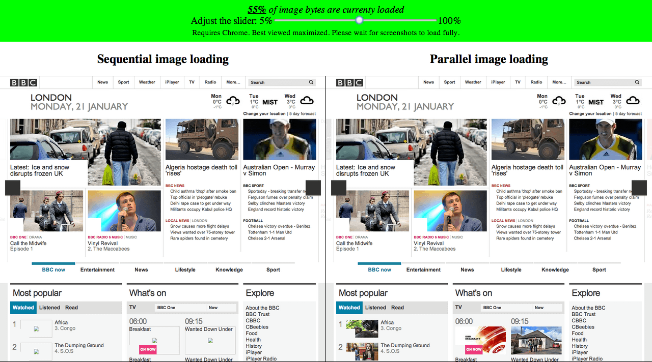
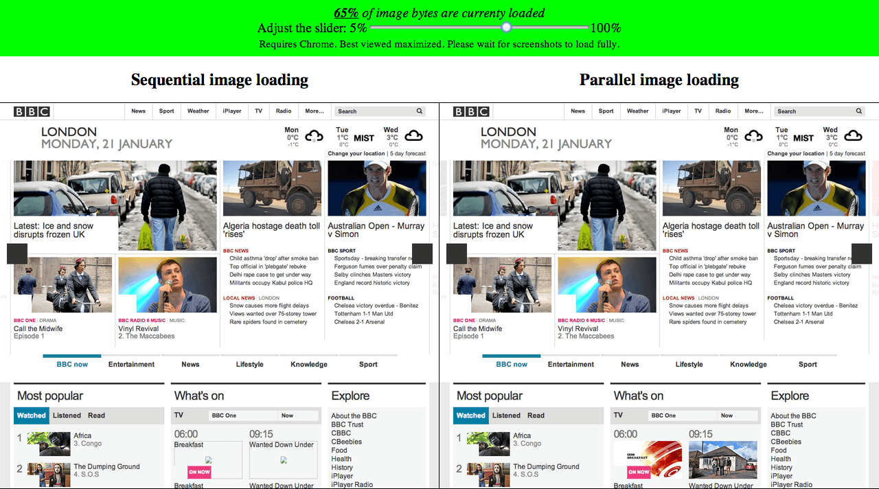
This led to BLOAT!!!

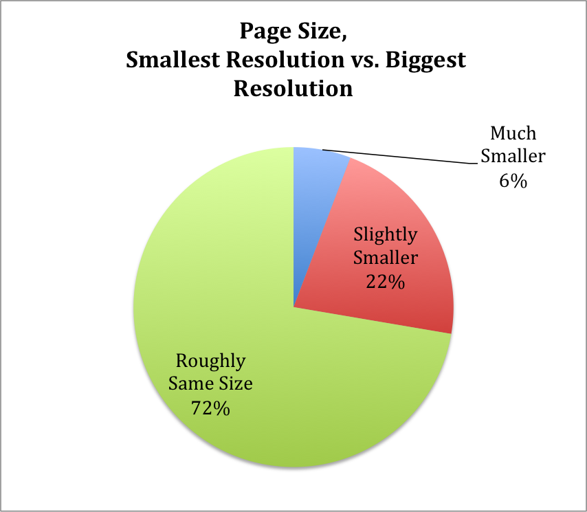
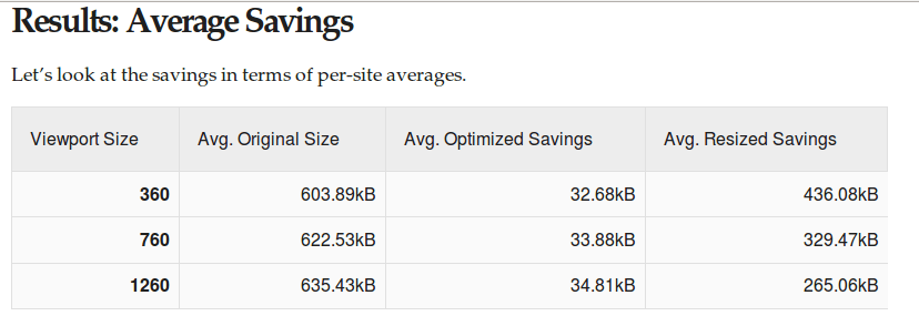
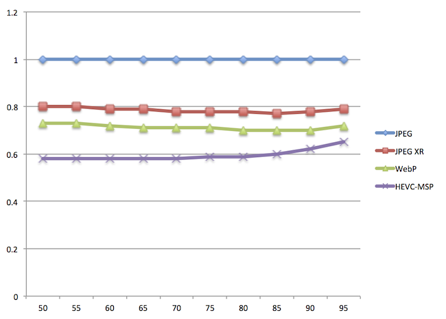
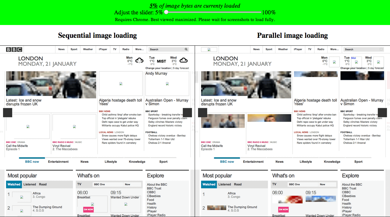
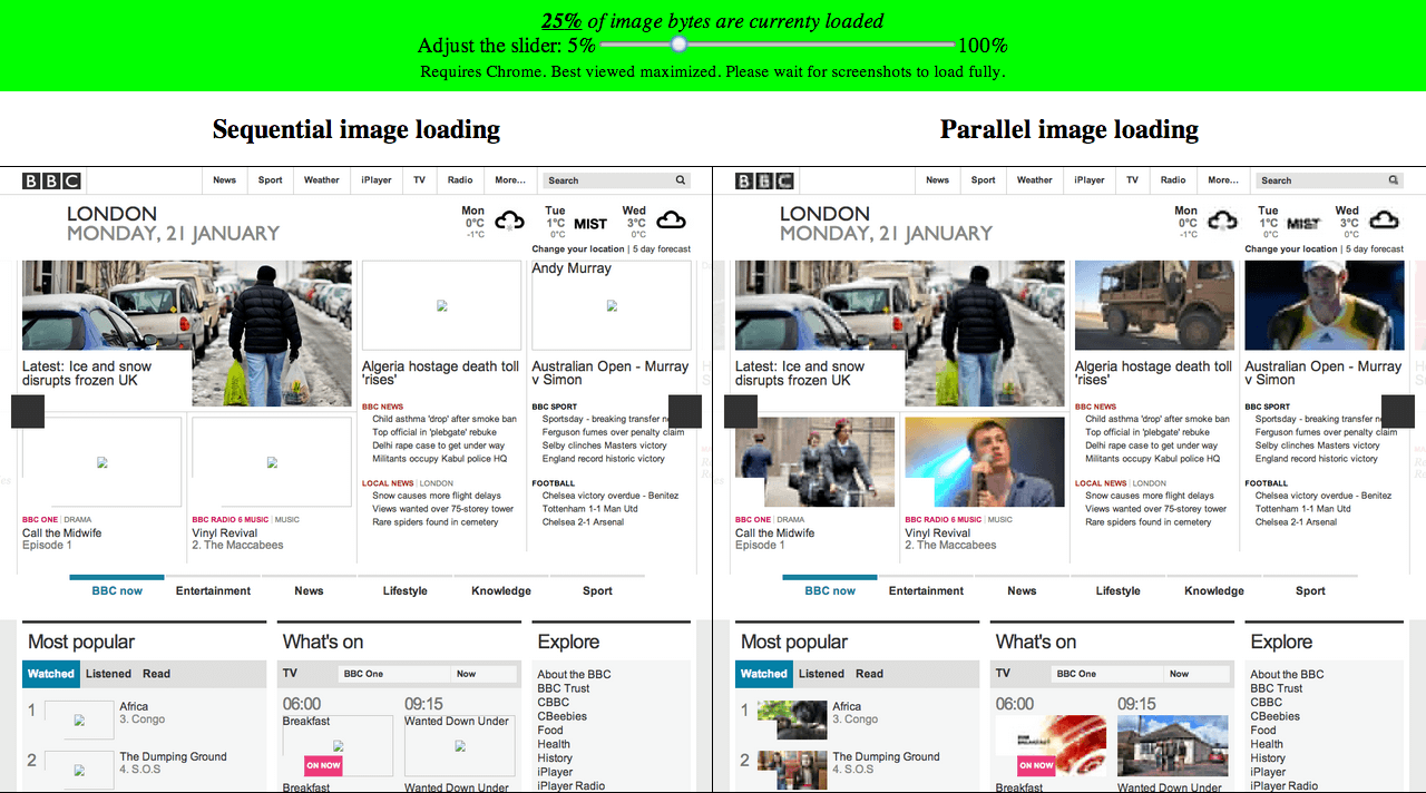
72% Serve same resources
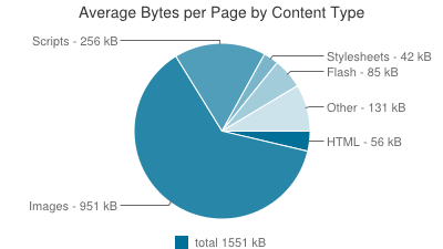
Which resources?
Images - over 61%
How much can be saved?
Up to™ 72% image data savings
So quality issues became
data plan abuse

And...
Large images?

People demanded a solution

Turned to the mailing lists

Proposals!

Moar proposals!

And the RICG was born
Picture vs. srcset
Turned into picture *with* srcset
Browsers weren't convinced

Src-N
Back to picture

And now

Picture 2.0™
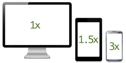
The srcset 'x' part
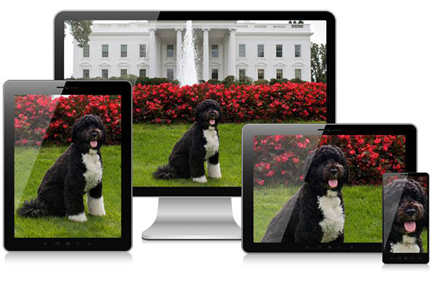
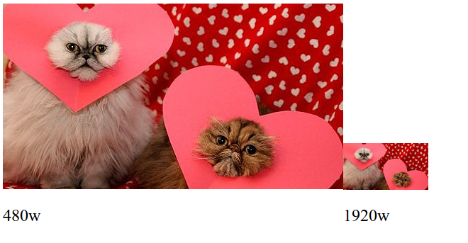
Use case - "Retina images"
Load hi-res images
on hi-res devices
The syntax
<picture>
<source media="(min-width: 45em)"
srcset="large.jpg 1x, large-2x.jpg 2x">
<source media="(min-width: 18em)"
srcset="medium.jpg 1x, medium-2x.jpg 2x">
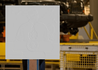
<img src="small.jpg" srcset="small-2x.jpg 2x"
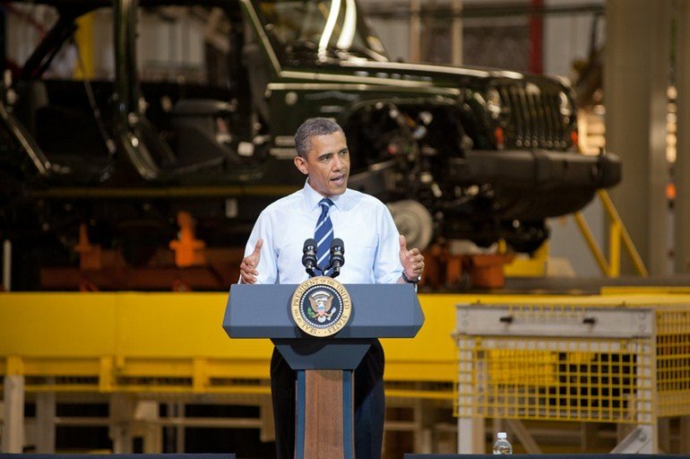
alt="The president.">
</picture>
Or even
<img src="small-1x.jpg" srcset="small-2x.jpg 2x"
     alt="The president.">
The <picture> part
Use case - Art direction
Use case #2 - MIME type fallback
The syntax
<picture>
<source media="(min-width: 45em)" srcset="large.jpg">
<source media="(min-width: 18em)" srcset="medium.jpg">
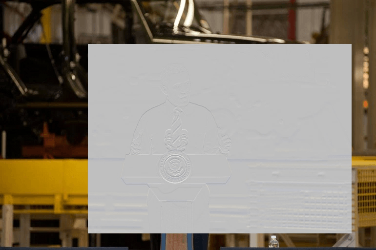
<img src="small.jpg" alt="The president.">
</picture>
The <img> is not optional
<picture>
     <source media="(min-width: 45em)" srcset="large.jpg">
     <source media="(min-width: 18em)" srcset="medium.jpg">
     <img src="small.jpg" alt="The president.">
</picture>
The sizes + srcset 'w' descriptor part

http://ericportis.com/posts/2014/srcset-sizes/
use case - variable width images

The syntax
<picture>
    <source media="(max-width: 80em)"
            sizes="(max-width: 30em) 100vw,
             (max-width: 50em) 50vw,
             calc(33vw - 100px)"
            srcset="pic100.jpg 100w, pic200.jpg 200w,
                    pic400.jpg 400w, pic800.jpg 800w, pic1600.jpg 1600w,
                    pic3200.jpg 3200w">
    <img src="otherpic.jpg" alt="The president giving an award.">
</picture>
Or even
<img src="otherpic.jpg" alt="The president giving an award."
     sizes="(max-width: 30em) 100vw,
         (max-width: 50em) 50vw,
         calc(33vw - 100px)"
     srcset="pic100.jpg 100w, pic200.jpg 200w,
             pic400.jpg 400w, pic800.jpg 800w, pic1600.jpg 1600w,
             pic3200.jpg 3200w">
Browser support

Blink - Chrome & Opera
Actively implementing!Firefox
Actively implementing!IE
Showing interestWebKit
Implemented srcset's 'x' descriptor
Willing to accept patches behind a compile flag
A look under the hood
Media Queries evaluation
PreloadScanner requires off-main-thread MQ eval
MediaQueryTokenizer
Based on eseidel's CSS syntax tokenizer
Implemented the parts needed for MQs and sizes
MediaQueryParser
Currently turned on only off-main-thread
MediaValues
Used by MediaQueryEvaluator
Cached variant - contains static values
Dynamic variants - refs a LocalFrame
MQ eval no longer depends on RenderStyle
Implements thread safe CSS length computation
SizesAttributeParser
Uses MediaQueryParser as a component
SizesCalcParser
Calc syntax => tokens => reverse polish notation => length
HTMLSrcsetParser
Parses the srcset attribute
'w' descriptors converted to DPR (using 'sizes')
Picks the best candidate to load
Intrinsic sizing
Moar intrinsic sizing
Stable state image loading
Required to avoid double download
Also required for img attribute setting
Worked on by Christian Biesinger (Thanks, Christian! :))
Possible future improvements
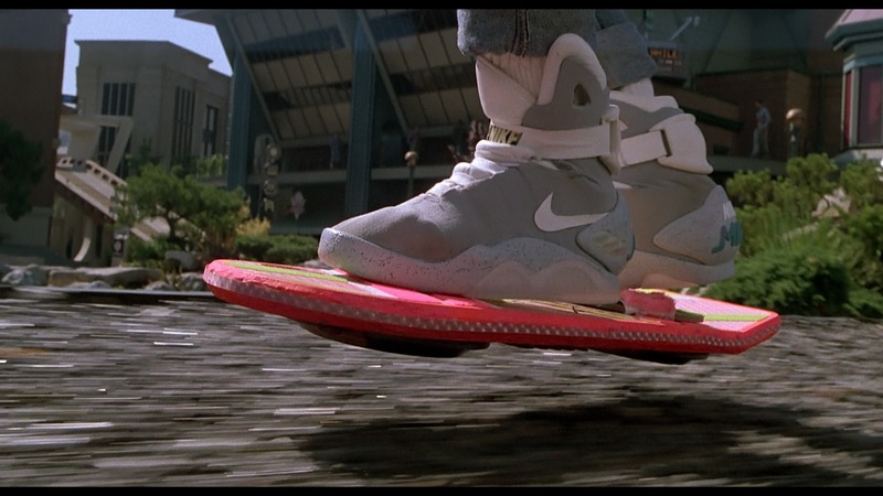
http://earnthis.net/brian-terrills-100-film-favorites-22-back-to-the-future-part-ii/
Client Hints
- Proposed by Ilya Grigorik
- HTTP based content-negotiation solution
- Client sends hints/capabilities
- Server side logic decides on resource
Responsive Image Container
- File format approach
- A "layer" per resolution
- Both resolution switching and art-direction
Resolution switching

336x635

106x200

211x400


336x635
Art-direction
770x512

200x200
400x288
770x512
Advantages
- Markup left untouched
- A single file per image
- Better for post-download dimensions changes
disadvantages
- Touches many layers. Will take time
- Decoding performance???
- Fetching mechanism network performance???
Do we have time?
Progressive image download

To sum it up
Thanks!
@yoavweiss on Twitter & GitHub